Try Studio Ceramics

A minimalistic logo that combines Emily's cute creations and her Chinese heritage.
Try Studio Ceramics is owned by Emily, a ceramics instructor born and raised in Hong Kong.
This logo is everything I asked for and more. It combines my heritage and my art style, and genuinely represents everything I want my business to be.
— Emily, Try Studio Ceramics
Emily, the owner of Try Studio Ceramics was looking for a rebrand, she's looking for a logo that is minimalistic so it can be made into a stamp, which will be her signature on all of her pieces; at the same time, she wanted the new logo to reflect the cute and whimsical nature of her pieces.
ROLE
Graphic designer
TIMELINE
1 month
LOCATION
Vancouver

challenge
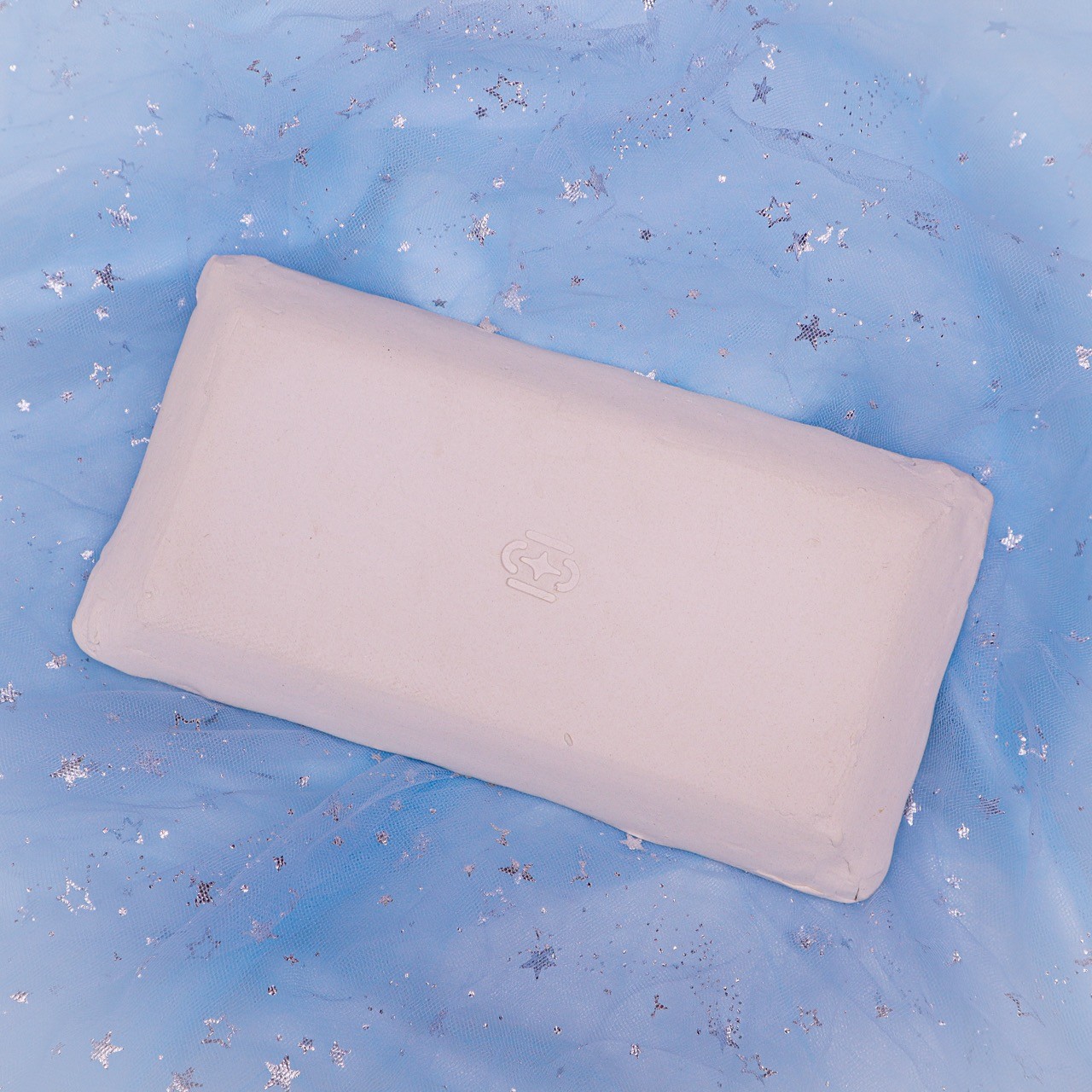
The biggest challenge of this project was combining all the elements Emily wanted to include in her logo, and yet keep it minimalistic. She wanted to include a nod to her Chinese heritage and the following motifs: star and mug.

process
Based on my research, one of the characters in Emily's Chinese name means jade (珵), I took the radical of that character (玉) and explored the variations of the character in history. I ended up expanding on one of the variations that resembles the mug and star motifs, which Emily specified.
Outcome
The result of this project is a minimal and cute logo that resembles a mug and the Chinese character for jade. It is a perfect balance and combination of whimsical and professional. The logo is now used as a stamp on all of Emily's pieces, as well as the face of the brand's online presence.